
comment - the current site plan feels a little under developed
response - revised site plan speaks more to a fully developed plan where the circulation and site movement patterns are more deliberate.

comment - the symmetry is hurting the resolution... how to get from one to another... studio to main entry from the site 'entry'?
response - the symmetry of the two buildings (dorm and admin/studio) are in response the the major axes (Boylston and the 'Pike'), there is a subtle axis created by the below grade parking in response to the Boylston Apartment Building adjacent to the site.


comment - must look at shading elements for the South facade...
response - the placement and sizing of the South facing glazing in addition to shading elements will play a part in the design and function of the dorm rooms. The dorm rooms are used sparingly and I believe that there is a way to allow morning sun in to aid the awaking of the students and also eliminate the heat gain from the sun during the day.


2 comments:
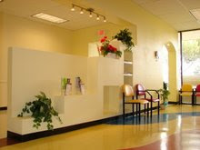
Ken, I’m glad you added a site plan. Unfortuantely it doesn’t make some of the critical aspects of your parti go away. The two bars almost collide near the intersection of Boylston and Mass Ave and the resulting space is less than clear, or desirable. In that “collision” you are creating the seeds for an interesting and natural main entrance into the academic building; the dorm bar is already addressing this by moving the elevator all the way to that end. Your site plan shows an arrow into the strange space created by the kinked stair coming down from the second floor (indeed a natural place for a main entrance); the ground floor however does show only a emergency type exit near the Lounge Pod-2. The main entrance (indicated by an air lock) leads a little past the half point (symmetry axes) back to a monumental stair. A gallery is accessible on the corner. In New England this entry would also require an air lock; the provided door reads more like an emergency exit. The below grade subtle axis can’t be experienced in the drawings presented; I doubt that they can influence the parti. Please work on the site plan and the entrances some more, I would like to see paving, planting, entrance doors/canopies, site furniture, et cetera.
To your credit most of your rooms carry a use label and resulting egress requirements. This is how you are creating the need for the stairs at the ends of the second floor academic building. The only space however, that is A-3 is the exhibit space and possibly a roof garden. Class rooms for higher education buildings are use group B. This fact might change your need for second means of egress out of the class rooms. We will however need two means of egress from the hallway on the second floor, into which all other spaces are exiting, including the exterior space.
I’m expecting you had a chance to discuss your sections with Chris, as they are currently more outlining mechanical systems than explaining the architecture.
Werner,
Thanks for the comments... I agree that this corner/colliding intersection appears to be a waste land and the next site plan speaks directly to those comments. Site amenities, materials, transitions, etc are also expressed... I want to have some more plan/elevation evolution as well... the next few post explore more of the elevations along Boylston. The linear theme is being expanded upon and driven vertical as well.
thanks
Post a Comment